
App Icons – Why So Blue?
I woke up this morning and parsed through some email on my mobile phone while enjoying my morning cup of joe. I double tap the home button to do what I do best(arguably) – multi-task. 🙂
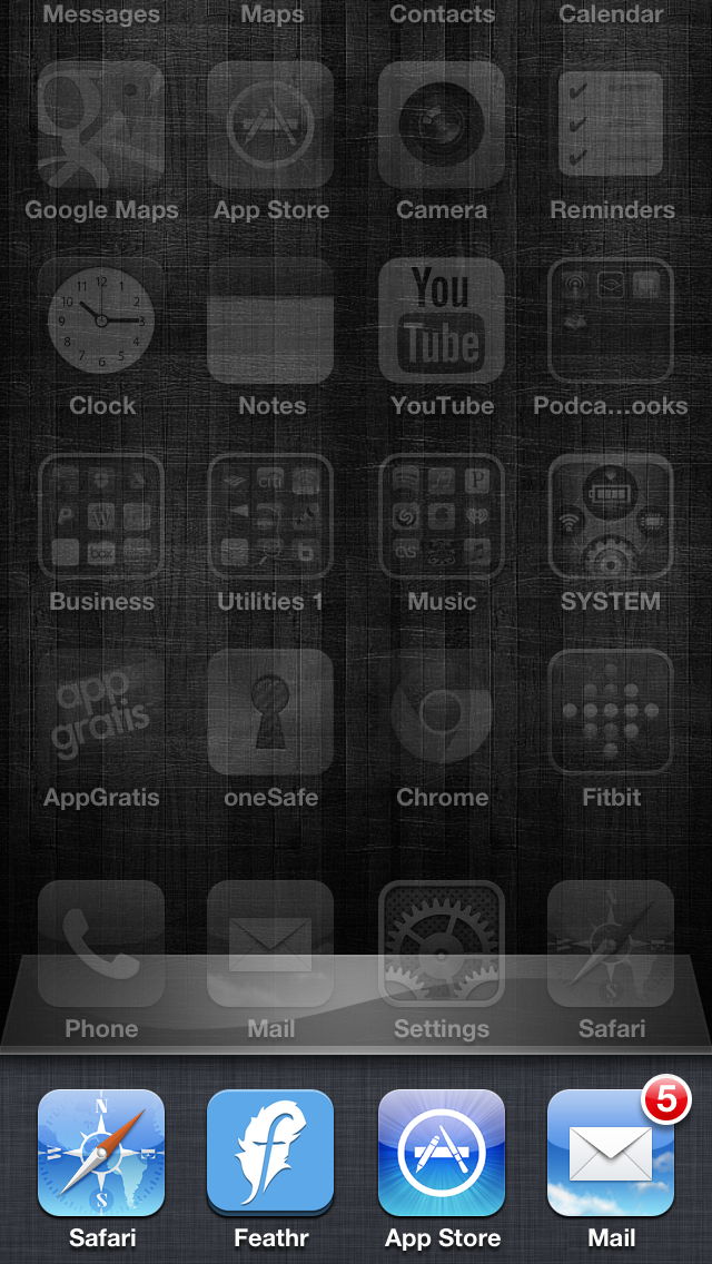
Here is what I’m looking at:
Mobile App Icons – Blue
I then take a screenshot to show you guys. I go to upload it to Dropbox (ironically has another Blue App Icon) and think, man this blue is really playing itself out!
Am I the only one that notices this?
A few other incredibly popular apps with blue icons you may be familiar with: Facebook, Echophone, Police Scanner, PayPal, LogMeIn, LinkedIn, Skype, MapMyRun and about 3 trillion others I don’t have the patience or bandwidth to mention 🙂
Why so down in the dumps people? Feeling a bit sad about someone or something? Or have you just read about the color of blue like I have and know that it’s a color of stability, trust, happiness and integrity? I hate to break it to you but not all apps exemplify all of those qualities so it’s ok to roll with some other colors. Show some creativity and showmanship by deviating a little bit. I, for one, will remember you more for being an outlier than bell curver.
I digress. The main point behind this post besides my utter sickness of the color blue is that it doesn’t hurt to go with another color as your base. Don’t be afraid. Live a little.
Designer’s tip:
Use richer and bolder shades of blue with a contrasting color if possible. Two good colors I always find to work well are orange and green.
Ciao for now!


Leave a Reply
Want to join the discussion?Feel free to contribute!